Creating an effective presentation involves more than just visually appealing design. It also requires a clear and logical flow of information. An effective presentation is a harmonious combination of our narrative, visuals, and slide design, all working together to convey our message persuasively and memorably.
To accomplish this, we need to ensure the clarity, visual appeal, consistency, and many other principles of the presentation slides we create.
The Key Principles of Presentation Design
Audience Engagement
A clear and logical flow of information allows viewers to stay engaged with the content and understand the information being presented.
Clarity
Slides should convey information clearly and concisely. Avoid clutter, and use a minimal amount of text. Each slide should have a singular, focused message or idea.
Visual Appeal
Visually appealing design elements used thoughtfully, can reinforce our message and make the content more engaging.
Consistency
Consistency helps create a cohesive and professional look. Use the same font, colors, and formatting for headings, bullet points, and other text elements.
Storytelling
Organize slides in a logical sequence that tells a story. Each slide should build on the previous one, creating a narrative flow that helps the audience follow our presentation more easily.
It’s essential to recognize that creating impactful designs or slides goes beyond mere aesthetics. It’s about crafting a cohesive story that captivates our audience’s attention and conveys our message effectively. Now, let’s explore how we can translate these key principles into actionable steps.
How Do We Implement the Principles?
After understanding the foundational principles, the next step is to apply them effectively in our designs. This involves careful consideration of layout, typography, color, contrast, graphics, and other elements to ensure our message is communicated clearly and engagingly.
Simplicity: Keep slides uncluttered. Avoid overcrowding with excessive text or graphics. A clean and minimalistic design ensures that our audience can focus on the key message.
Balance: Distribute elements evenly across the slide. Achieve balance by arranging content in a visually appealing way, avoiding heavy concentration on one side of the slide.
White space: Make effective use of white space (empty space) around elements on the slide. It provides visual “breathing room” and helps guide the viewer’s eyes to the most important content.
Alignment: Ensure that text and graphics are aligned properly. Consider using grids and guidelines to assist in aligning elements precisely. This can help us create a structured and organized layout.
Example:
These following two examples include the exact same information, however, there’s a trade-off: simplicity, balance, increased white space, and alignment makes it easier to follow but fewer visual representations of a concept might make it harder to interpret at first.
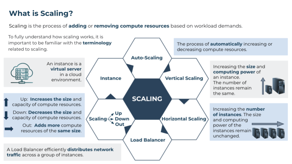
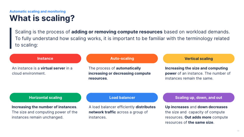
Hierarchy: Use a clear visual hierarchy to highlight important points. Larger fonts, bolder text, or different colors can be employed to distinguish main ideas from supporting information.
Alignment: Ensure that text and graphics are aligned properly. Left alignment is often preferred for text, as it makes content easier to read.
Typography: Choose legible fonts for your text. Sans-serif fonts like Arial or Helvetica are often easier to read on screens. Maintain a reasonable font size, typically around 24pt or higher for presentations, to ensure readability.
Example:
We can use font size, font color, colored text boxes, and other forms of formatting to ensure that the more important concepts are highlighted. Although left alignment is most preferred for text, center and right alignment can also be used effectively in very specific situations. Our choice of font color can also contribute to readability.


Color scheme: Select a color scheme that is visually appealing and conveys the message effectively. We need to be mindful of color accessibility, ensuring that our color choices are suitable for all audiences.
Using contrast: Use contrasting colors for text and backgrounds to enhance interpretability and readability.
Intentional color use: Use color to evoke emotion, create connection, and tell stories.
Example:
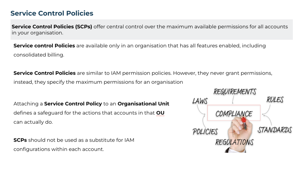
Colors that are too similar can make it difficult to differentiate between key concepts and messages. The use of contrasting colors is extremely important in ensuring accessibility. Color stories can be achieved by using the same color for text and graphics that represent the same concept. It is often even more effective maintaining this consistency throughout an entire presentation.


Quality and size: Use high-quality images and ensure that they are appropriately sized (with the correct aspect ratio) and do not pixelate when projected.
Purpose: Images should enhance our message, not distract from it. These images or graphics should also be relevant to the message we are trying to convey.
Example:
To ensure our design looks professional, we need to maintain the correct aspect ratio of images and graphics, i.e., keep the proportional relationship between an image’s width and height. Furthermore, rather than using images to fill gaps, we can increase the size of our font, add more whitespace, add a subtle background shape, and/or decrease the proximity between text paragraphs.

By incorporating the key principles of presentation design, we can elevate our presentations from mere slideshows to powerful tools for communication and persuasion. Through simplicity, clarity, visual appeal, and thoughtful use of elements such as layout, typography, color, contrast, and imagery, we can captivate our audience’s attention and leave a lasting impression.


